Are you on brand?
A brand cannot be defined by a single word or image. It's a composition of imagery, motion, typography, color, and message. It's the people, the office, the GIFs we share. All of these elements make up a company, and ultimately, how that company is perceived. Density cares very much about perception.
We've created these guidelines to help you communicate, design, and develop to the standards we continue to set and will ultimately surpass.
Our mark is comprised of 2 components—the mark and logotype. If the logo’s intended context is outside of a density digital or physical product, we recommend using the full logo unless the spacial constraints are tight.
Black and white are the preferred logo colors.
The full logo should never be used smaller than 24px. The logomark should never be used smaller than 14px.
Notice that both the logomark and full logo require significant white space—give them room to breath.
Density is a two color brand with varying shades of a cinder black that transitions into an off white. We use our primary blue sparingly, and with clear purpose.
#4198FF
0.25, 0.60, 1.00
$brand-primary;
#222A2E
0.13, 0.16, 0.18
$gray-darker;
#4E5457
0.31, 0.33, 0.34
$gray-dark;
#8E9299
0.56, 0.57, 0.60
$gray;
#B4B8BF
0.71, 0.72, 0.75
$gray-light;
#F0F0F2
0.89, 0.89, 0.90
$gray-lighter;
If the situation calls for more color—this should suffice.
#14BB83
0.99, 0.42, 0.42
$brand-success;
#FE6B6B
0.08, 0.73, 0.51
$brand-danger;
Density’s imagery is clean and polished. Our product lives mainly in office buildings. But a blank space is often used to allow people to imagine their own space and focus on the product.
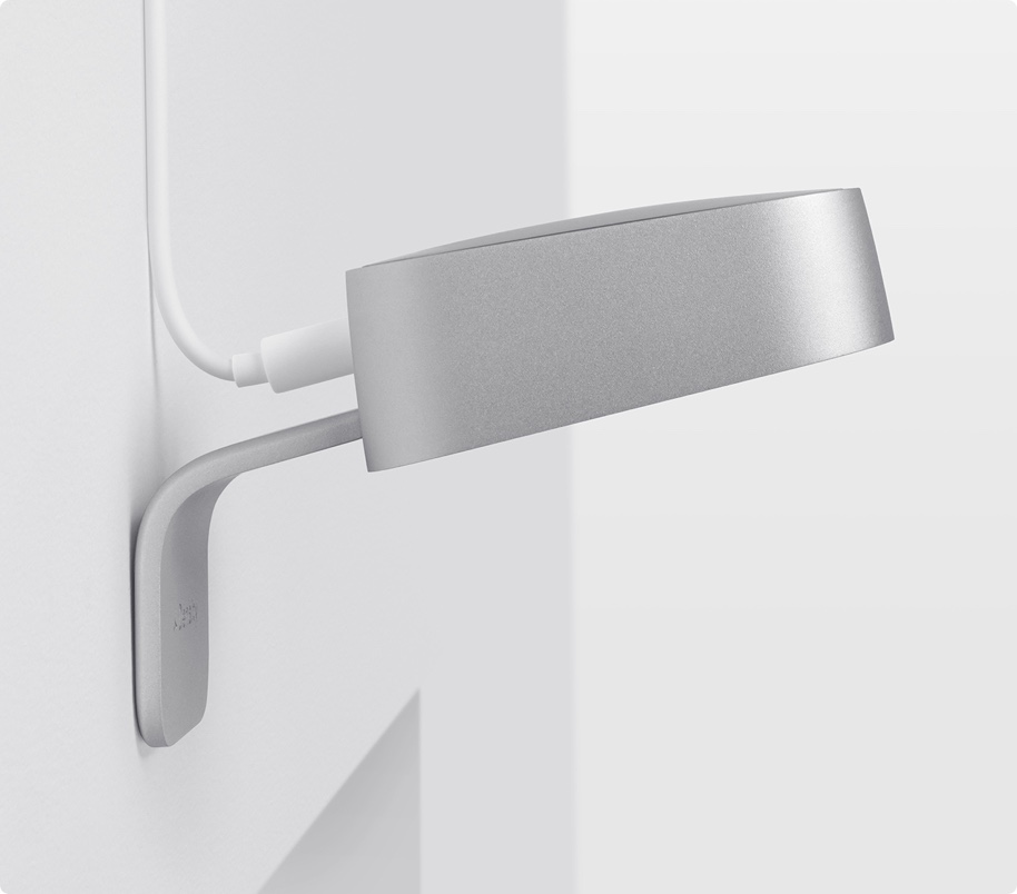
You can crop the device in an attempt to create a more dramatic effect or emphasize more subtle details of the design. Do so with care and craft.
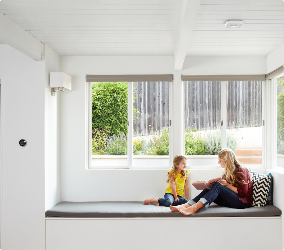
We like environment shots where the device can be featured as a part of an environment. Doing so can either be done minimally, essentially clearing the observers mind and letting them imagine Density in their own space—or displaying an explicit pre-existing environment with a Density installation (Nest example below).
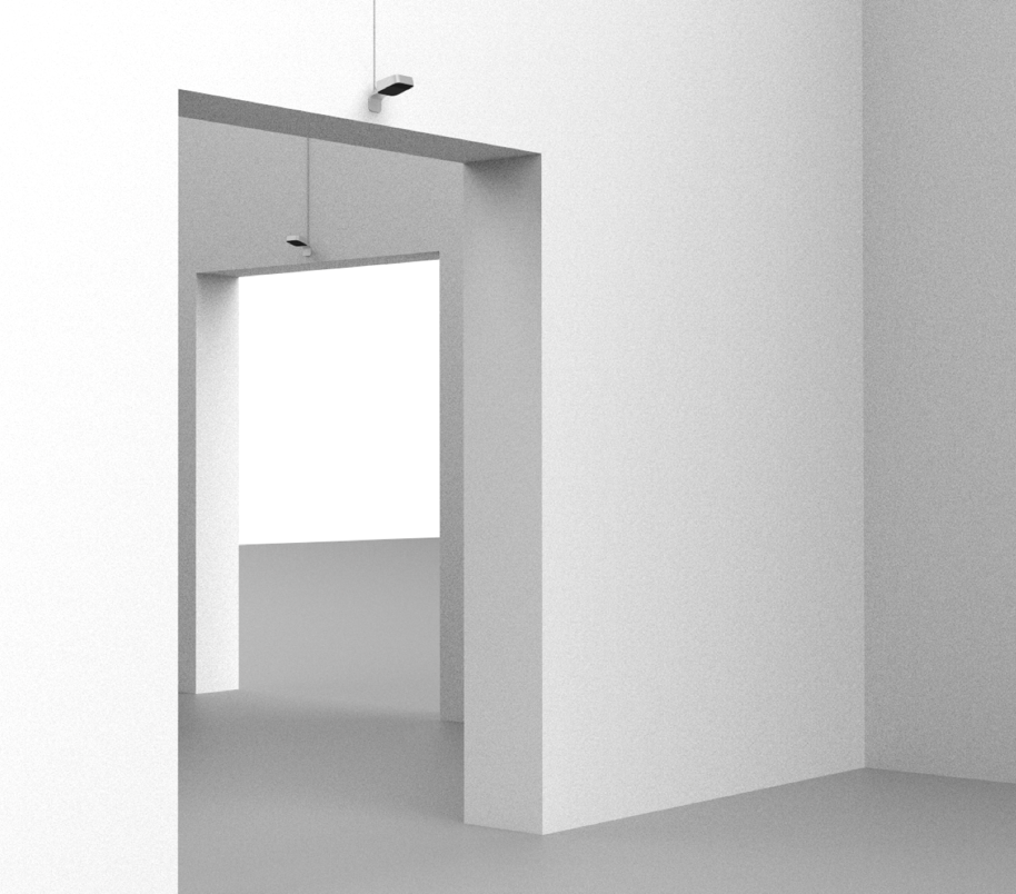
We give our product and typography room to breath. The two should never compete for space and always compliment each other. In most cases however, the focus should be placed on the product.
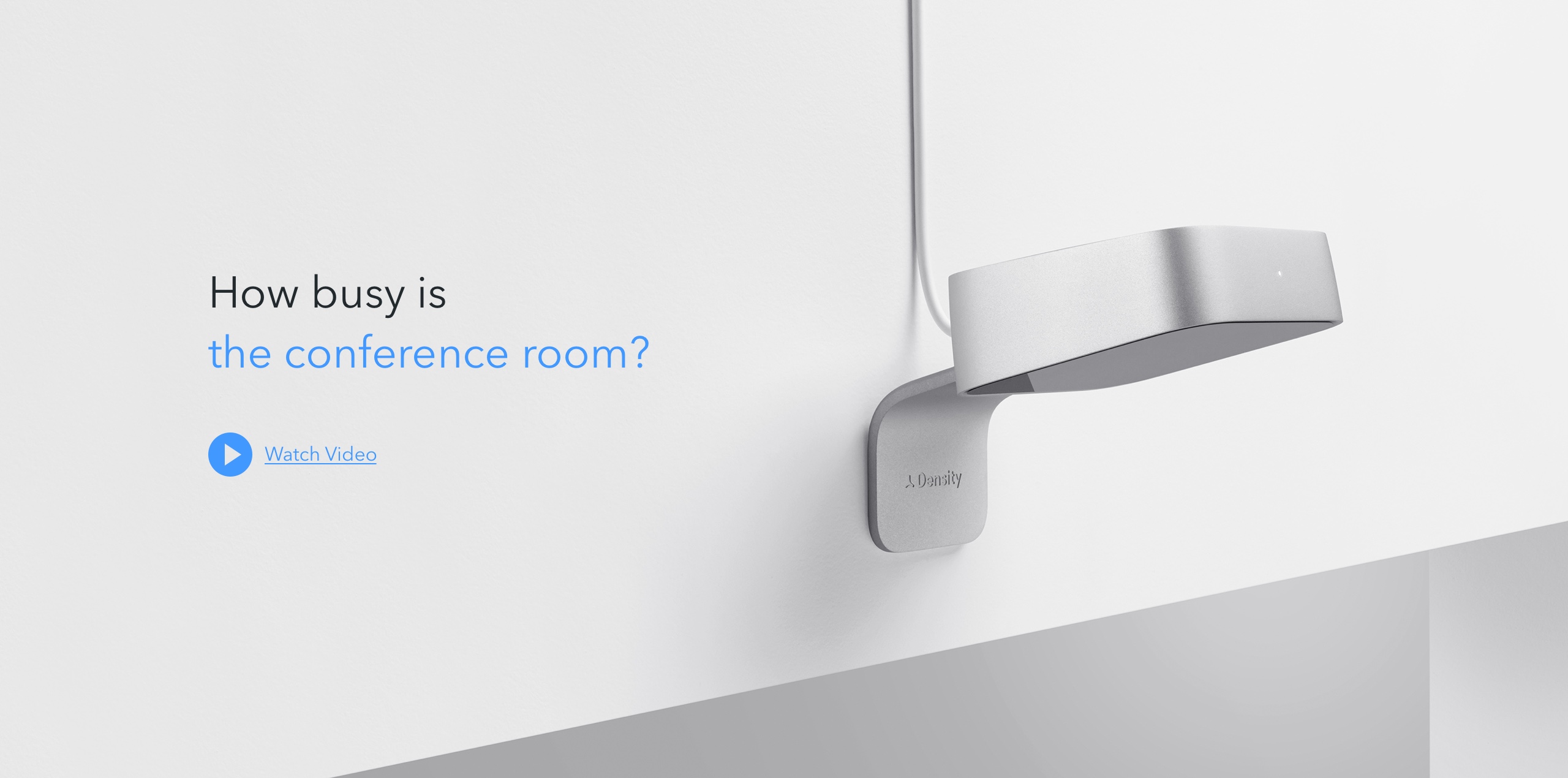
We don’t hide our cables on completed installation shots. Aesthetically, its less than ideal, but we do not want to send mixed messages around whether or not this product is a wired or wireless solution.
People used in photos should feel natural to the space and match the tone of the space. As in, we should be simulating real environments.


The words we use have a heavy impact on our brand perception. When writing copy, it's important to keep these simple concepts in mind.
Put simply: we build a small sensor that measures how busy a location is in realtime. Customers mount the unit above any single or double entry doorway, connect it to power and WiFi, and use our API to access how many people have visited.
We believe we're providing the world with the tools to acquire a fundamental layer of information that, to this day, does not exist.
In order for Density to succeed, we believe that our data can never compromise the following core tenants:
If Density were a person she wouldn’t be too sarcastic or go out-of-her-way to be funny. She’s not a bubbly, friendly robot but she’s not severe either. Density is direct, plain spoken, clever and concise. She uses alliteration and turns of phrase. Density cares about good design and simple colors. She’s non-threatening, non-combative, always on and always accurate. Because she values privacy, she is physically incapable of capturing personally identifiable information.
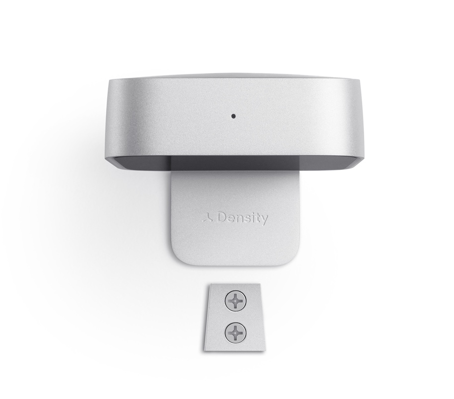
Her sensor is both remarkable and invisible. If you’re a busy person you won’t notice her as you enter a room. If you’re curious, it’s entirely possible to spend half an hour considering the painstaking detail and material finish that she put into her sensor’s construction.
Architecturally, Density’s data comes from her cloud processing. She learns from all deployed units, connected like coral. If misunderstood by her algorithm, an errant door detected in one part of the network will teach her how to handle other errant doors elsewhere.
If a sensor ever breaks, Density is designed to be swapped out. A simple, universal mount remains installed. Her broken sensor can be popped off, sent back, replaced, and brought back online quickly.
Density values utility and believes that by solving a remarkably simple problem, she can help humans make better use of their space.
Density’s packaging is a customer's first interaction with our physical product. It should reflect our brand, and our product’s intentions.
The Density packaging design should revolve around 2 core concepts:
All inspiration is collected in our Mood Board.
Density’s face is familiar. We fit into any business or office setting. Our goal is to be as honest as possible and recognizable as a result of our capabilities and merit.
Density’s look should be perceived as:
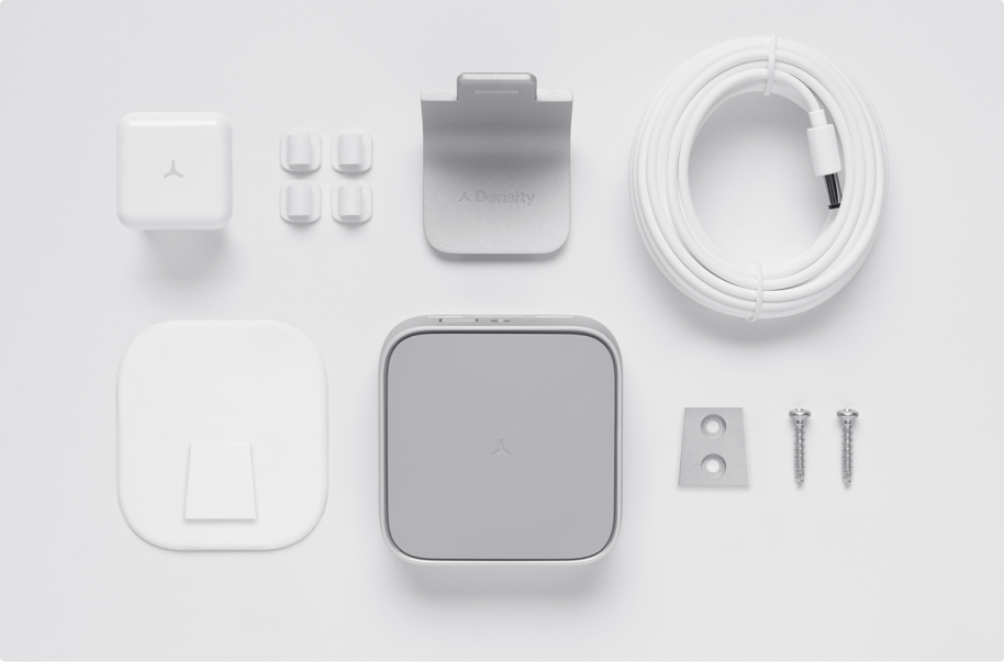
A Density box contains the key components necessary for a successful and painless self installation.
We’ve identified the following constraints for our box design:
The mechanism for opening the box should be obvious and easy. However, the design however should not sacrifice the security and the box should remain closed when being handled.
Sensor and mount must be displayed separately side by side. Sensor's top curved face shoul be parallel to the box top. Other elements in the box should be compact, organized, and have some level of presentation.
If the packaging design includes a sleeve, we must use high quality paper and printing. It must be durable to wear and tear and protect the printed graphics.
Density’s packaging should be developed using easily recyclable materials. Curb side recycling is a plus.
Box and padding should protect the sensor from any damage during shipping and potential drops. Finish on sensor and accessories should be protected from scratches.
Density’s graphic design is best described as reserved and involves the following:
The box design should reflect these principles.
All bar code and certification elements should be thoughtfully placed and unobtrusive.
Box dimensions should lend themselves well for palletizing.
Sr. Industrial Design/Packaging PM | kyleh@density.io
Digital Design/Packaging Graphic Design | kyleo@density.io
Design Director | robert@density.io
We've consolidated all of our assets here for easy access. If you're just want everything click the link below:
Give me EverythingDownload our logo set in black, white, and vector format.